
Back to all projects
Atlante Sales LLC
Design System
Overview
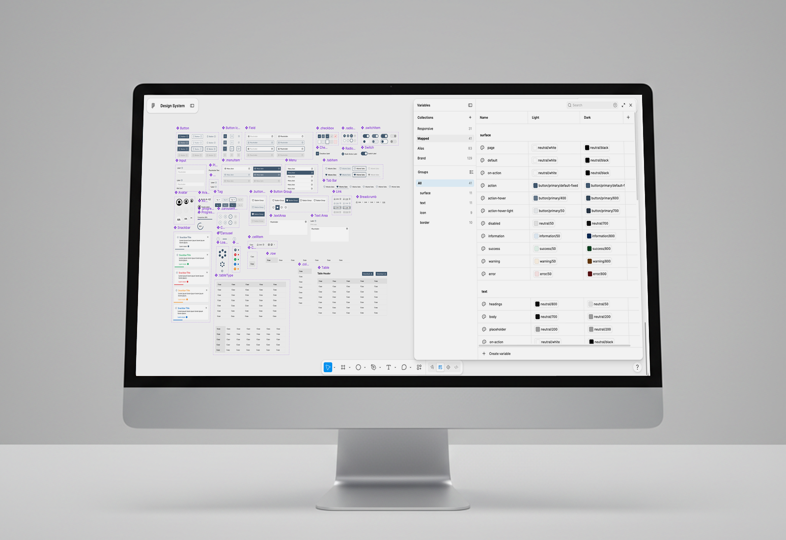
The Atlante Sales design system was built from scratch to support the sales tool as it expands from a desktop web app into a native mobile application with pared-down functionality.
The system started with a hand-built colour scale, derived from the company's branding and standard interface colour needs, structured into variables and collections organized in a three-tiered approach. From there, a component library covering core UI elements — buttons, fields, menus, inputs — gives the team a consistent foundation to design from as the product grows across both desktop and mobile surfaces.
Foundational Decisions
Every design decision in this system was made to serve one goal: a single source of truth that scales cleanly across desktop and mobile, without duplicated work or visual drift between platforms.
Colour
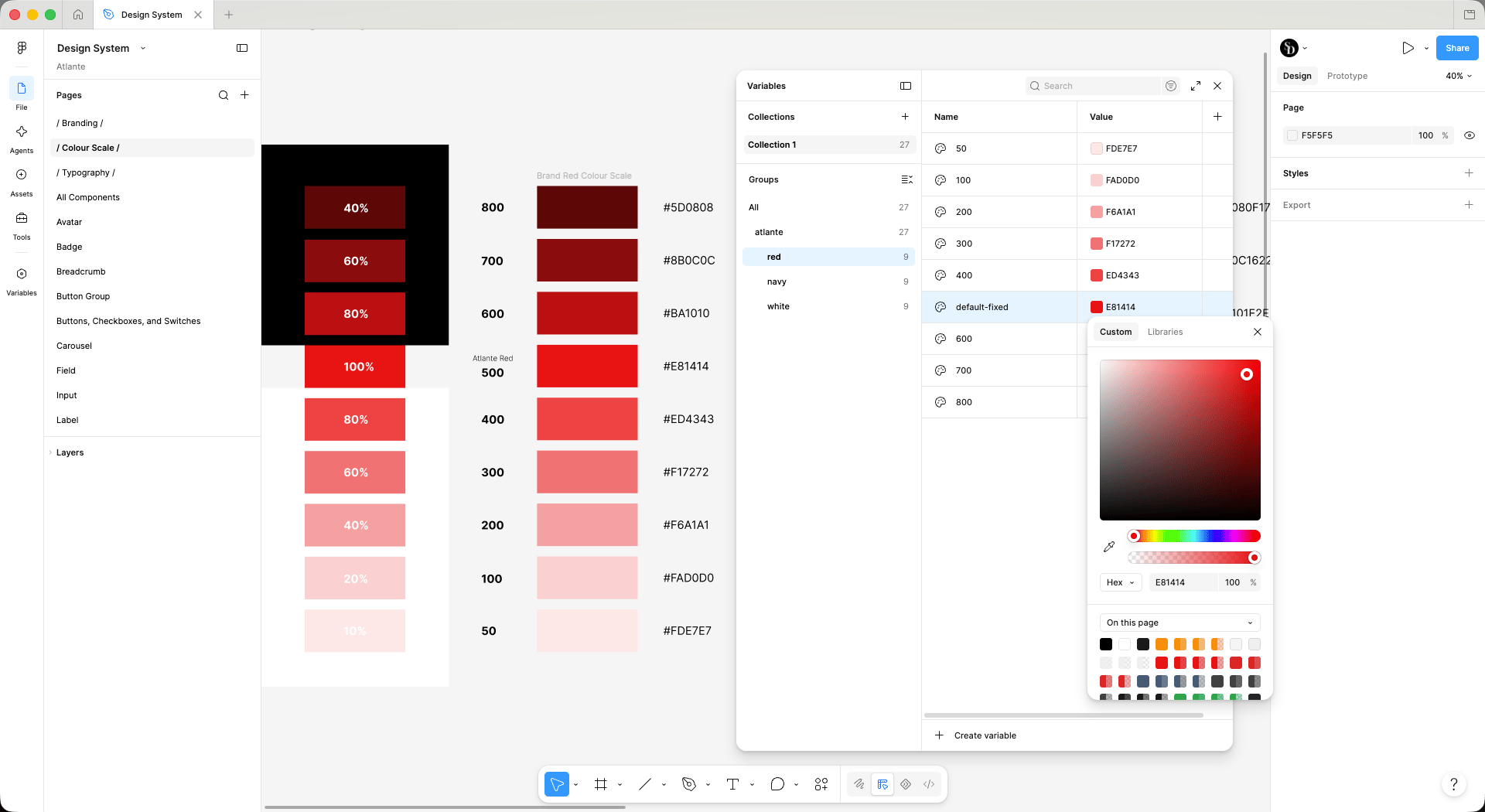
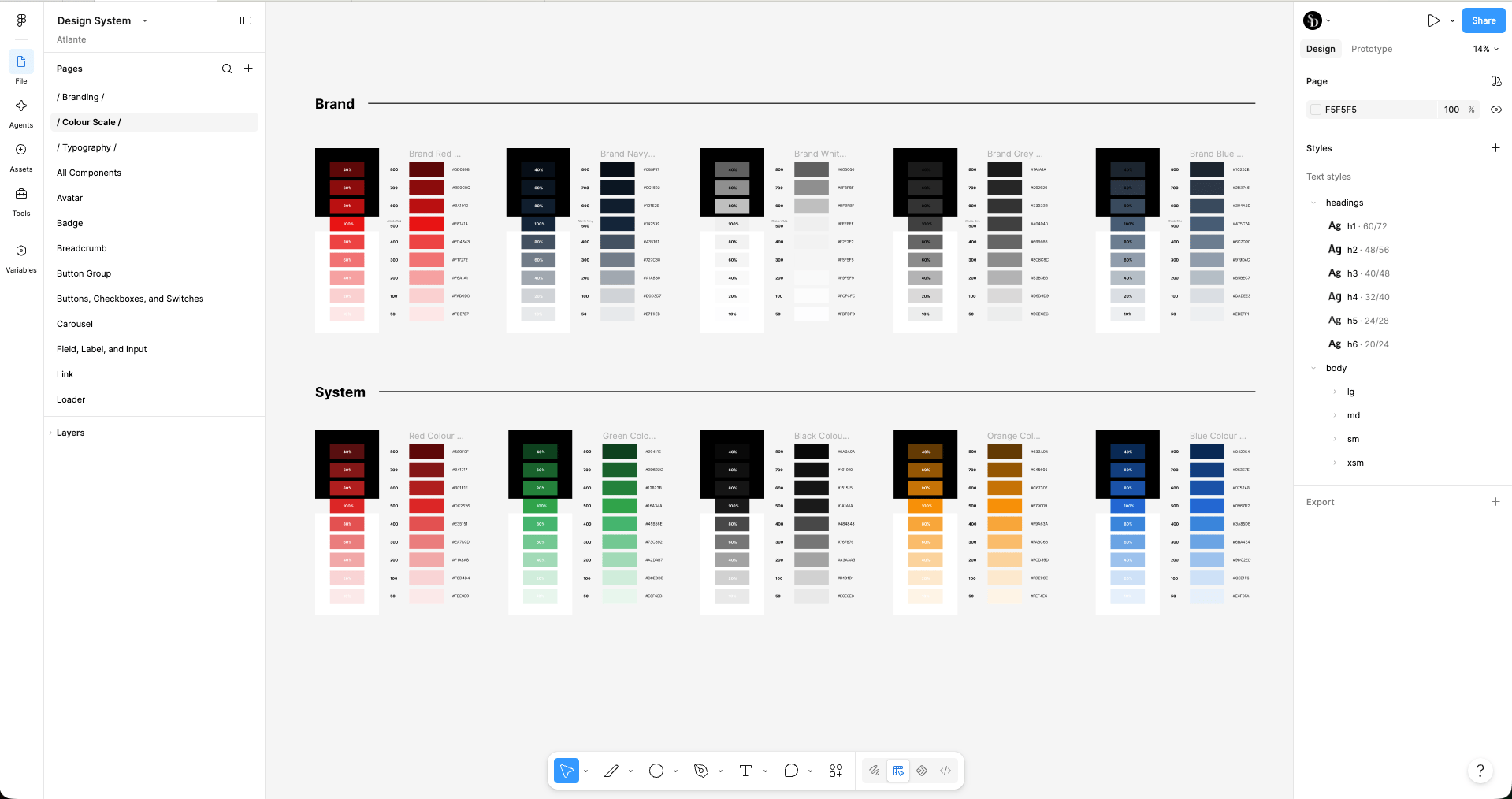
Starting with Atlante’s brand colours — #E81414 (red), #142539 (navy), #EFEFEF (white), #404040 (grey), and #475C74 (blue) — I expanded them into full 9-step scales (50 through 800). They are weighted so the mid-tones sit close to the true brand colour rather than an evenly interpolated gradient. Alongside the brand palette, I built a parallel set of standard system colours — red, green, orange, blue, black — to cover functional states (success, warning, error, information) that the brand palette alone couldn't support. Keeping brand and system colours as separate, clearly labeled scales meant the two would never get confused or misused as the component library grew.
Typography
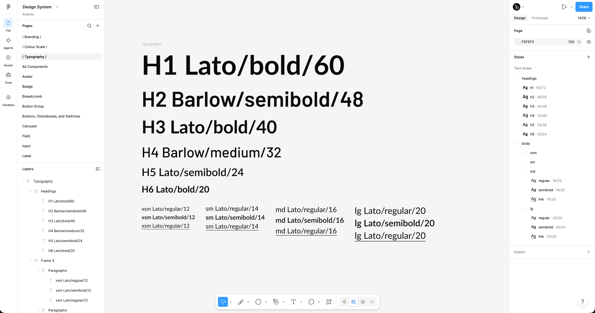
I used two typefaces in this system, Lato for stronger, high-emphasis headings (H1, H3, H6) and paragraph text, and Barlow for a lighter editorial contrast on others (H2, H4). The paragraph text is paired with a scale (xsm through lg) covering regular, semibold, and link states at each size. I structured type as reusable text styles rather than one-off text boxes, so every heading and body instance across the product pulls from the same defined scale.
Token Architecture
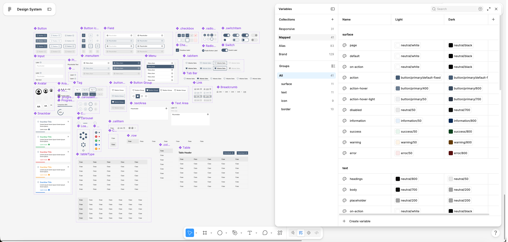
I utilized a three-tiered system to organize the variable collections: raw Brand values (the actual hex colours — 129 variables), Alias tokens that assign those raw values to a use case (e.g., defining what "primary action" or "error" refers to), and Mapped tokens (the final values that are used for component fills and strokes, carrying Light and Dark mode values so a component's appearance resolves correctly per theme without any manual switching). A Responsive collection sits adjacent to Mapped rather than beneath it in the same chain. This collection governs values that shift by viewport, like text size and spacing, which follow breakpoint logic rather than theme logic. Keeping those two concerns in separate collections means a component can independently resolve "what colour am I in dark mode" and "what size am I on mobile" without either one interfering with the other.
Component library
I built the library to cover the full range of interface elements needed for the product: buttons, inputs, fields, checkboxes, radio buttons, switches, menus, tabs, tables, breadcrumbs, avatars, tags, carousels, progress indicators, snackbars, and system notifications.
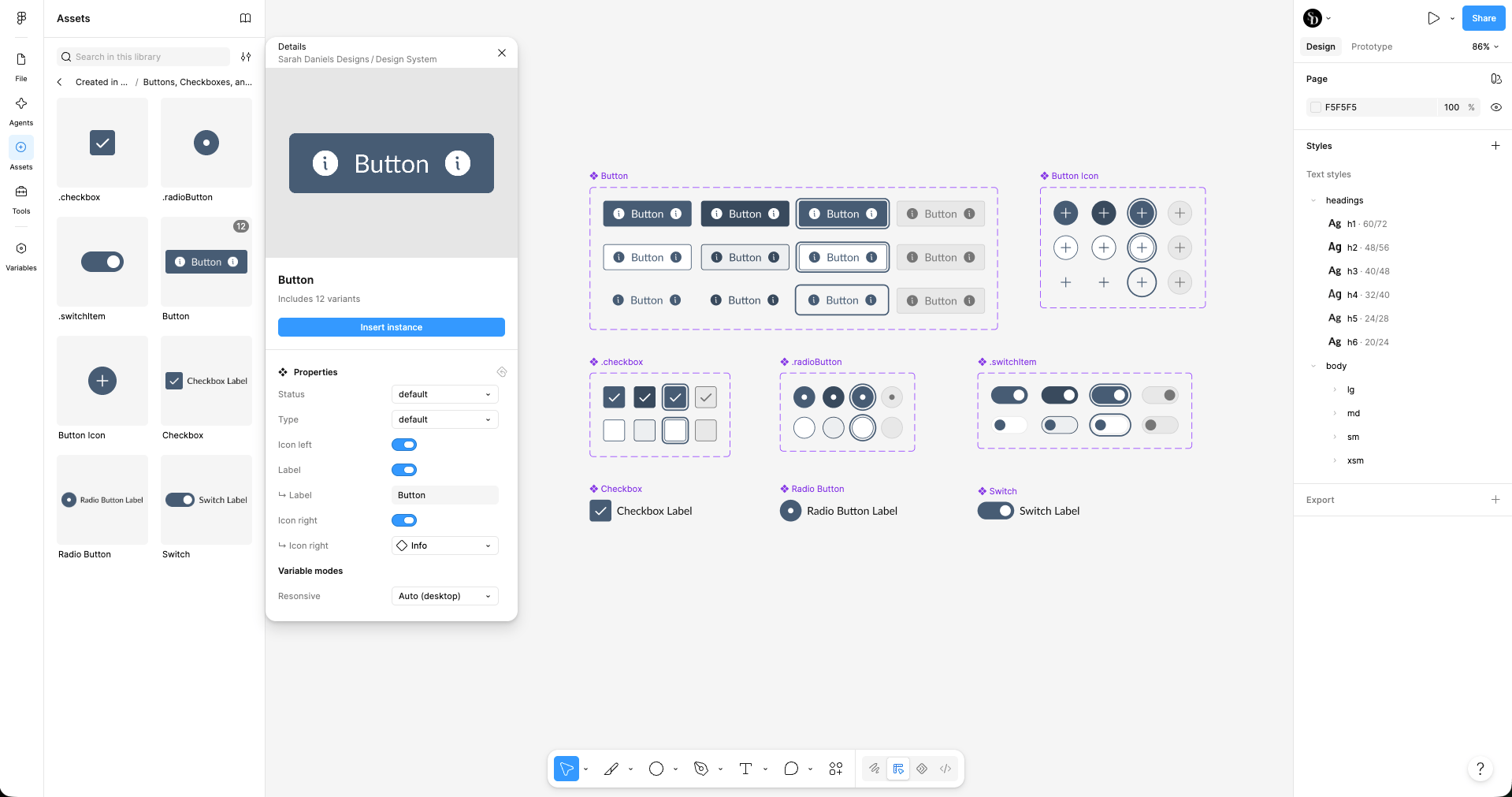
Each component uses variant-based properties rather than duplicated one-off instances. The Button component, for example, carries 12 variants driven by properties like status, type, and toggleable icon/label slots, so one component definition covers every state instead of requiring a new copy for each combination. Checkboxes, radio buttons, and switches follow the same pattern — a shared property structure across default, hover, focused, and disabled states.
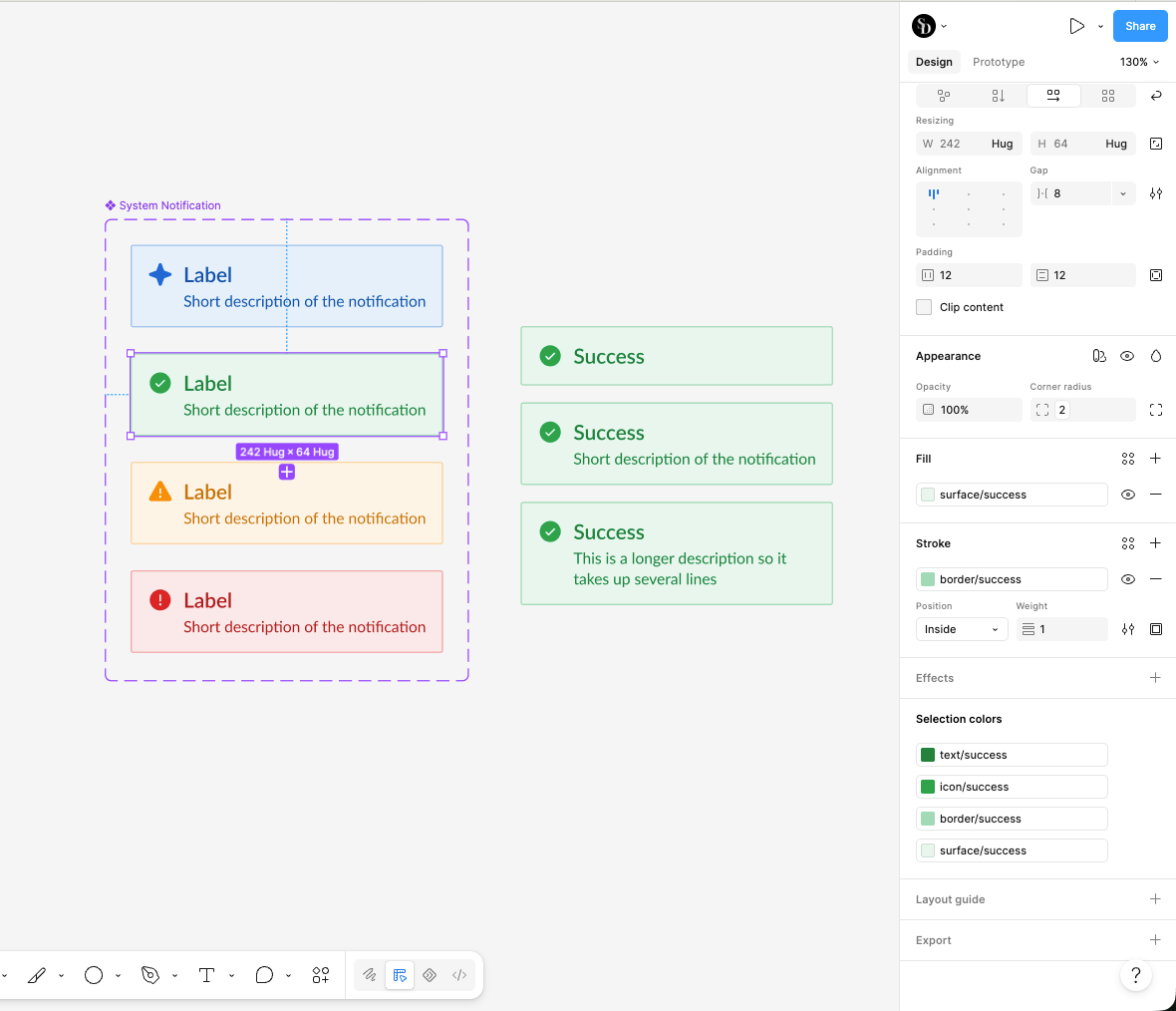
Every component consumes the semantic token layer rather than raw colour values. The System Notification component, for instance, pulls its background, border, icon, and text colours entirely from the success/warning/error/information semantic groups. That means a single token update propagates through every component using it, instead of requiring a manual pass through each one individually.
Built for handoff
This system was structured from the outset with handoff to engineering in mind — not left as a set of static screens for a developer to interpret after the fact.
The three-tiered token architecture (Brand → Alias → Mapped/Responsive) is the clearest example as it mirrors how a token system would actually be structured in code. Semantic names map directly to what a developer would build as design tokens or CSS variables. Components are similarly built with clearly defined variant properties (status, type, icon/label toggles) instead of one-off instances, which gives a developer a direct one-to-one reference for the props or states a component needs to support in code.
The goal of this project was to remove ambiguity before a single line of implementation code gets written so that when handoff does happen, the system hands over a clear specification, not just a set of finished-looking mockups.
What’s Next
I'm currently developing the mobile mockups using this system as the foundation, with implementation planned in the near future. Because the token architecture already accounts for responsive and dark mode behaviour which extends the system to mobile is a matter of applying it to new layouts, not rebuilding the underlying logic from scratch.

Like what you see? Let’s connect

Sarah Daniels
Product Design
Back to all projects
Atlante Sales LLC
Design System
Overview
The Atlante Sales design system was built from scratch to support the sales tool as it expands from a desktop web app into a native mobile application with pared-down functionality.
The system started with a hand-built colour scale, derived from the company's branding and standard interface colour needs, structured into variables and collections organized in a three-tiered approach. From there, a component library covering core UI elements — buttons, fields, menus, inputs — gives the team a consistent foundation to design from as the product grows across both desktop and mobile surfaces.
Foundational Decisions
Every design decision in this system was made to serve one goal: a single source of truth that scales cleanly across desktop and mobile, without duplicated work or visual drift between platforms.
Colour
Starting with Atlante’s brand colours — #E81414 (red), #142539 (navy), #EFEFEF (white), #404040 (grey), and #475C74 (blue) — I expanded them into full 9-step scales (50 through 800). They are weighted so the mid-tones sit close to the true brand colour rather than an evenly interpolated gradient. Alongside the brand palette, I built a parallel set of standard system colours — red, green, orange, blue, black — to cover functional states (success, warning, error, information) that the brand palette alone couldn't support. Keeping brand and system colours as separate, clearly labeled scales meant the two would never get confused or misused as the component library grew.
Typography
I used two typefaces in this system, Lato for stronger, high-emphasis headings (H1, H3, H6) and paragraph text, and Barlow for a lighter editorial contrast on others (H2, H4). The paragraph text is paired with a scale (xsm through lg) covering regular, semibold, and link states at each size. I structured type as reusable text styles rather than one-off text boxes, so every heading and body instance across the product pulls from the same defined scale.
Token Architecture
I utilized a three-tiered system to organize the variable collections: raw Brand values (the actual hex colours — 129 variables), Alias tokens that assign those raw values to a use case (e.g., defining what "primary action" or "error" refers to), and Mapped tokens (the final values that are used for component fills and strokes, carrying Light and Dark mode values so a component's appearance resolves correctly per theme without any manual switching). A Responsive collection sits adjacent to Mapped rather than beneath it in the same chain. This collection governs values that shift by viewport, like text size and spacing, which follow breakpoint logic rather than theme logic. Keeping those two concerns in separate collections means a component can independently resolve "what colour am I in dark mode" and "what size am I on mobile" without either one interfering with the other.
Component library
I built the library to cover the full range of interface elements needed for the product: buttons, inputs, fields, checkboxes, radio buttons, switches, menus, tabs, tables, breadcrumbs, avatars, tags, carousels, progress indicators, snackbars, and system notifications.
Each component uses variant-based properties rather than duplicated one-off instances. The Button component, for example, carries 12 variants driven by properties like status, type, and toggleable icon/label slots, so one component definition covers every state instead of requiring a new copy for each combination. Checkboxes, radio buttons, and switches follow the same pattern — a shared property structure across default, hover, focused, and disabled states.
Every component consumes the semantic token layer rather than raw colour values. The System Notification component, for instance, pulls its background, border, icon, and text colours entirely from the success/warning/error/information semantic groups. That means a single token update propagates through every component using it, instead of requiring a manual pass through each one individually.
Built for handoff
This system was structured from the outset with handoff to engineering in mind — not left as a set of static screens for a developer to interpret after the fact.
The three-tiered token architecture (Brand → Alias → Mapped/Responsive) is the clearest example as it mirrors how a token system would actually be structured in code. Semantic names map directly to what a developer would build as design tokens or CSS variables. Components are similarly built with clearly defined variant properties (status, type, icon/label toggles) instead of one-off instances, which gives a developer a direct one-to-one reference for the props or states a component needs to support in code.
The goal of this project was to remove ambiguity before a single line of implementation code gets written so that when handoff does happen, the system hands over a clear specification, not just a set of finished-looking mockups.
What’s Next
I'm currently developing the mobile mockups using this system as the foundation, with implementation planned in the near future. Because the token architecture already accounts for responsive and dark mode behaviour which extends the system to mobile is a matter of applying it to new layouts, not rebuilding the underlying logic from scratch.

Like what you see? Let’s connect
Sarah Daniels
Product Design
Atlante Sales LLC
Design System
Overview
The Atlante Sales design system was built from scratch to support the sales tool as it expands from a desktop web app into a native mobile application with pared-down functionality.
The system started with a hand-built colour scale, derived from the company's branding and standard interface colour needs, structured into variables and collections organized in a three-tiered approach. From there, a component library covering core UI elements — buttons, fields, menus, inputs — gives the team a consistent foundation to design from as the product grows across both desktop and mobile surfaces.
Foundational Decisions
Every design decision in this system was made to serve one goal: a single source of truth that scales cleanly across desktop and mobile, without duplicated work or visual drift between platforms.
Colour
Starting with Atlante’s brand colours — #E81414 (red), #142539 (navy), #EFEFEF (white), #404040 (grey), and #475C74 (blue) — I expanded them into full 9-step scales (50 through 800). They are weighted so the mid-tones sit close to the true brand colour rather than an evenly interpolated gradient. Alongside the brand palette, I built a parallel set of standard system colours — red, green, orange, blue, black — to cover functional states (success, warning, error, information) that the brand palette alone couldn't support. Keeping brand and system colours as separate, clearly labeled scales meant the two would never get confused or misused as the component library grew.
Typography
I used two typefaces in this system, Lato for stronger, high-emphasis headings (H1, H3, H6) and paragraph text, and Barlow for a lighter editorial contrast on others (H2, H4). The paragraph text is paired with a scale (xsm through lg) covering regular, semibold, and link states at each size. I structured type as reusable text styles rather than one-off text boxes, so every heading and body instance across the product pulls from the same defined scale.
Token Architecture
I utilized a three-tiered system to organize the variable collections: raw Brand values (the actual hex colours — 129 variables), Alias tokens that assign those raw values to a use case (e.g., defining what "primary action" or "error" refers to), and Mapped tokens (the final values that are used for component fills and strokes, carrying Light and Dark mode values so a component's appearance resolves correctly per theme without any manual switching). A Responsive collection sits adjacent to Mapped rather than beneath it in the same chain. This collection governs values that shift by viewport, like text size and spacing, which follow breakpoint logic rather than theme logic. Keeping those two concerns in separate collections means a component can independently resolve "what colour am I in dark mode" and "what size am I on mobile" without either one interfering with the other.
Component library
I built the library to cover the full range of interface elements needed for the product: buttons, inputs, fields, checkboxes, radio buttons, switches, menus, tabs, tables, breadcrumbs, avatars, tags, carousels, progress indicators, snackbars, and system notifications.
Each component uses variant-based properties rather than duplicated one-off instances. The Button component, for example, carries 12 variants driven by properties like status, type, and toggleable icon/label slots, so one component definition covers every state instead of requiring a new copy for each combination. Checkboxes, radio buttons, and switches follow the same pattern — a shared property structure across default, hover, focused, and disabled states.
Every component consumes the semantic token layer rather than raw colour values. The System Notification component, for instance, pulls its background, border, icon, and text colours entirely from the success/warning/error/information semantic groups. That means a single token update propagates through every component using it, instead of requiring a manual pass through each one individually.
Built for handoff
This system was structured from the outset with handoff to engineering in mind — not left as a set of static screens for a developer to interpret after the fact.
The three-tiered token architecture (Brand → Alias → Mapped/Responsive) is the clearest example as it mirrors how a token system would actually be structured in code. Semantic names map directly to what a developer would build as design tokens or CSS variables. Components are similarly built with clearly defined variant properties (status, type, icon/label toggles) instead of one-off instances, which gives a developer a direct one-to-one reference for the props or states a component needs to support in code.
The goal of this project was to remove ambiguity before a single line of implementation code gets written so that when handoff does happen, the system hands over a clear specification, not just a set of finished-looking mockups.
What’s Next
I'm currently developing the mobile mockups using this system as the foundation, with implementation planned in the near future. Because the token architecture already accounts for responsive and dark mode behaviour which extends the system to mobile is a matter of applying it to new layouts, not rebuilding the underlying logic from scratch.

Like what you see? Let’s connect
Back to all projects
Sarah Daniels
Product Design